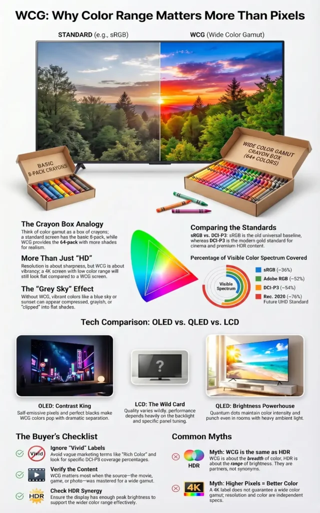
If you have ever compared two screens side by side and wondered why one looks richer even when both claim “HD” or “4K,” the answer is often not resolution at all. In a lot of real-world testing, the difference comes down to color range. That is exactly why Wide Color Gamut (WCG) matters more than most people realize.
I run whatismyscreenresolution.site because I kept seeing people focus only on pixel count while ignoring the display traits that actually change how a screen feels in daily use. After testing laptops, TVs, phones, and external monitors over time, one pattern keeps showing up: people blame brightness or panel type first, but a lot of the “wow” factor is really about how much color the screen can reproduce.
A wider color gamut gives a display more room to show richer reds, cleaner greens, and more believable gradients instead of flat-looking tones. It is one of those features that looks boring on a spec sheet and then becomes obvious the moment you see it in person. In this guide, I’ll keep it practical and explain what color gamut actually means, how WCG differs from basic color support, where it matters most, and how to tell whether it is actually worth paying for.
Also Read: OLED Technology Explained: How OLED Displays Improve Picture Quality
Quick Answer: What Is Wide Color Gamut (WCG)?
Wide Color Gamut (WCG) means a display can show a broader range of colors than standard sRGB. In simple terms, a wide gamut display can reproduce richer, more lifelike colors than a standard sRGB-only screen, which is why movies, games, and photos often look less washed out—especially when the content was mastered for wider color spaces like DCI-P3 or Rec. 2020.
It matters most on HDR movies, modern games, and photo editing workflows where richer color detail is actually present in the source content.
Understanding Color Gamut
Color gamut is simply the range of colors a device can display or capture. Think of it like a box of crayons. A small box still gets the job done, but a bigger box gives you more shades to work with. In display terms, a standard gamut like sRGB covers a more limited range, while wider gamuts such as Adobe RGB, DCI-P3, and Rec. 2020 cover more of what our eyes can perceive. Microsoft’s official HDR settings documentation for Windows also notes that many HDR-capable displays support a wider gamut than sRGB, which helps explain why HDR content often looks noticeably more vivid on a properly configured screen.
That wider range matters because color is not just decoration. It changes mood, realism, and clarity. A skin tone that is slightly off can look strange. A neon sign that is too muted can lose its punch. A blue sky that is compressed into a smaller color range can feel grayish even when the image is technically sharp. So when people say a display looks “better,” they are often reacting to the color gamut, not just the resolution or brightness.
The Evolution of Color Gamut
Early consumer displays were built around limited color targets because the hardware could not reproduce much more. sRGB became the common baseline for web content, desktop use, and general consumer devices. It was practical, predictable, and good enough for a long time. Adobe RGB then became important for photographers and print workflows because it gave more room in the green-to-cyan range, which helped with editing and reproduction.
As TVs, phones, and monitors improved, creators wanted more than sRGB could offer. That is where wider spaces like DCI-P3 and Rec. 2020 entered the conversation. DCI-P3 became especially important in cinema and HDR workflows, while Rec. 2020 became a larger target for future-facing video standards. On the display side, VESA’s updated DisplayHDR specification explicitly ties together luminance, color gamut, bit depth, and response behavior, which is a good reminder that strong HDR performance is never just about peak brightness alone.
Quick Comparison of Common Color Gamuts
| Color Gamut | Typical Use Case | Approximate Coverage of Visible Colors |
| sRGB | Web, standard monitors, general consumer content | ~36% |
| Adobe RGB | Photography and print workflows | ~52% |
| DCI-P3 | Digital cinema, HDR video, premium displays | ~54% |
| Rec. 2020 | UHD / future-facing HDR video standard | ~76% |
Important note: These percentages are useful for rough comparison, but they should not be treated like the whole story. Real-world display quality still depends on calibration, brightness, contrast, color volume, and how well the panel actually reproduces the target gamut.
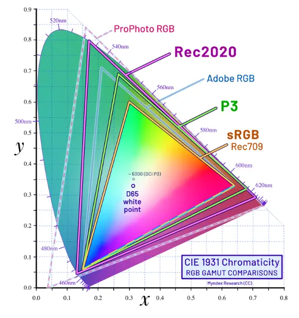
If you are comparing wide color gamut vs sRGB, the short version is simple: sRGB is the older baseline, while wide color gamut gives modern displays more room to show richer and more realistic color.
How Wide Color Gamut Actually Works
Wide Color Gamut, or WCG, means a display can reproduce a broader range of colors than the older sRGB standard. It does not automatically mean the screen is brighter, and it does not automatically mean the image is better. It means the screen has the ability to show more color detail, provided the source content and the display pipeline actually support it.
That is why WCG and HDR are often discussed together. They are not the same thing, but they make a lot more sense as a pair. In practice, a display needs both wider color support and enough brightness control to make HDR content actually look convincing instead of just slightly punchier.
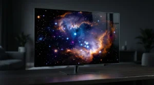
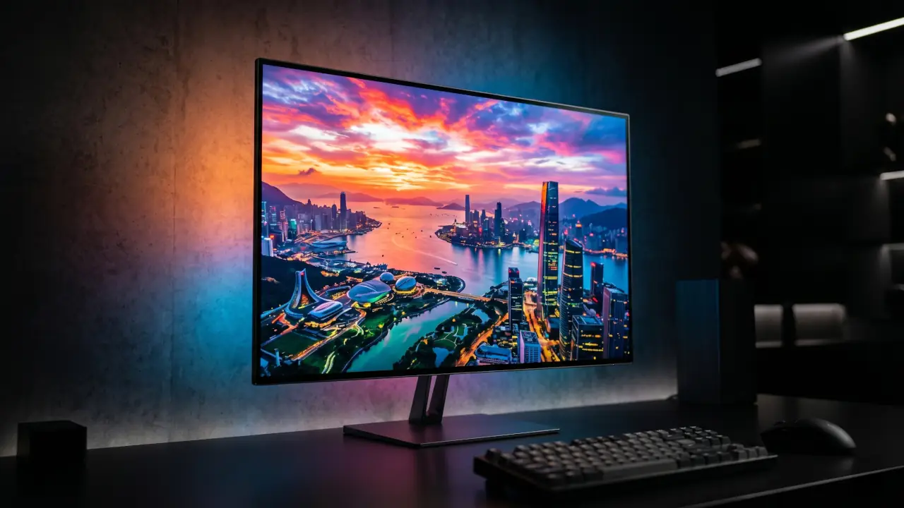
In everyday terms, WCG is the reason a nature clip can look less washed out, a movie can feel more cinematic, and a game can have more vivid effects without looking cartoonish. The key is that wide gamut gives the display more color room to work with. That extra room matters most when the content was created for it and the screen can show it properly.
Common Mistakes People Make About Wide Color Gamut
One reason WCG confuses so many buyers is that it gets mixed up with other display terms all the time. In my experience, these are the most common mistakes:
If you understand those four points, you already avoid the biggest buying mistakes most people make.
Wide Color Gamut in Practice
The practical side of WCG is where things get interesting, because different display technologies handle it in different ways. On a modern OLED, the panel’s self-emissive pixels can produce extremely deep blacks and strong contrast, which makes rich colors feel more dramatic. On a QLED display, the quantum dot layer helps expand color performance and brightness, which is why QLED often looks especially strong in bright rooms. LCD panels can also support WCG, but their final result depends heavily on the backlight, the panel type, and how well the manufacturer tuned the color output.
This is where a lot of people get confused. A display can advertise WCG and still look average if the rest of the chain is weak. The source content has to be wide-gamut too. The operating system has to manage color correctly. The display has to actually cover enough of the target space. And if you are watching video, the mastering has to be done with the right color targets in mind. That is why some screens look stunning with one movie and only slightly better than SDR with another.
OLED
OLED is one of the easiest places to notice WCG because the screen’s contrast makes saturated colors stand out without looking muddy. Dark scenes keep their depth, so the color itself feels more alive. That is one reason OLED TVs are often praised for movie watching and premium gaming. The colors are not just “more,” they are often easier to separate from the background because the blacks are so clean.
QLED
QLED usually shines when brightness matters. In a bright living room, a high-brightness display with a wide color gamut can keep color punch intact even under strong ambient light. That is useful for sports, daytime TV, and gaming in well-lit spaces. The point is not that QLED is always better than OLED. It is that QLED often holds color intensity better when the room itself is fighting the image.
WCG on LCD
LCD is more mixed because the category covers a huge range of quality levels. A budget LCD might stay close to the older standard color range, while a better LCD with a stronger backlight system or quantum dot layer can reach much wider color. So LCD is not automatically weak—it is just less predictable. In my experience, this is where spec sheets can be the most misleading, because two “HDR” LCDs can look very different once you actually put them in the same room.
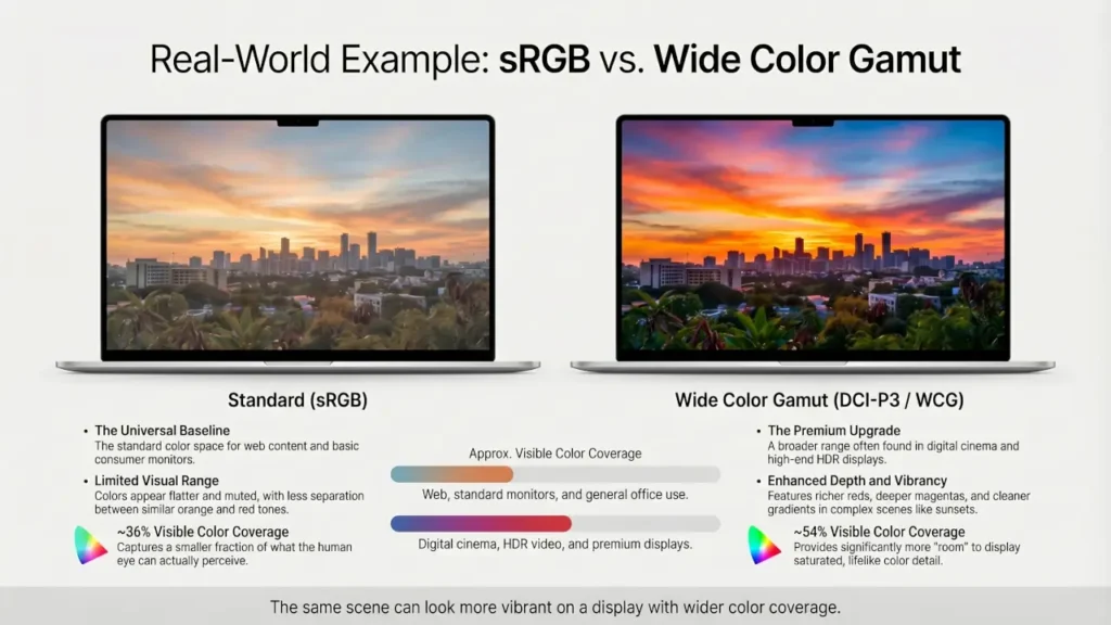
A Simple Real-World Example
One of the easiest ways I explain WCG to people is with a side-by-side comparison. If you play the same HDR nature video on a basic sRGB laptop panel and then on a display that covers most of DCI-P3, the difference is usually obvious within seconds.
The grass looks less gray, sunset tones separate better, and bright reds stop clipping into a single flat shade. I have seen plenty of people assume the “better” screen was higher resolution when the sharper impression actually came from better color reproduction, not extra pixels.
This kind of side-by-side comparison is where wide color gamut becomes obvious, even to people who do not know the technical terms yet.
How to Check Wide Color Gamut Before You Buy
If you are shopping for a display, do not rely on vague phrases like “rich color,” “vivid display,” or “HDR-ready.” What matters is the actual color coverage.
Here is what I recommend checking first:
- DCI-P3 coverage — a strong real-world target for movies, HDR content, and modern premium displays
- sRGB coverage — useful as a baseline, especially for general-purpose monitors
- DisplayHDR certification — helpful, but only if the panel also has decent brightness and real gamut coverage
- Independent reviews — some spec sheets look impressive until you compare measured results
If I am evaluating a screen quickly, I usually look for high DCI-P3 coverage plus enough brightness to support HDR properly. That tells me much more than a generic marketing badge ever will.
Real-World Applications
In real-world content, WCG shows up wherever color matters more than you think. Live TV and broadcast workflows often intersect with Hybrid Log-Gamma because HLG was built for flexible delivery across different display types. For modern HDR viewing, WCG supports the richer look people expect from current streaming and premium TV content. In practice, this is what makes a sunset, a concert stage, or a product demo look more convincing.
Photography
Photography is one of the clearest use cases for WCG. A wider gamut helps preserve subtle differences between similar tones, which matters for skin, shadows, skies, and saturated colors like flowers or fabric. Adobe’s documentation around Adobe RGB is a good reminder that broader color spaces exist for a reason: they help creators work with a richer range of colors before final output. If you edit photos on a narrow-gamut display, you may not even notice what is missing until the image is viewed elsewhere.
Video Production
Video production needs WCG because creators want their work to survive translation from edit timeline to final playback. Modern color management tools and HDR workflows increasingly expect wider gamuts and higher bit depth so the image does not fall apart during tone mapping or export. That is also why this area connects closely to HDR formats. Different formats handle metadata and playback differently, but the color foundation underneath them is often wide-gamut content. That is also why formats like Dolby Vision, HDR10, and HLG often come up in the same conversation, even though wide color gamut is only one part of the overall HDR experience.
Gaming
Gaming is where WCG becomes a “feel it immediately” feature. Fire, magic spells, neon signs, sunsets, explosions, and rich environments all benefit from a wider color range. It can make a game feel more alive without changing the actual art direction. That is exactly the kind of change players notice when WCG is done right. You may not describe it as “color gamut” while playing, but you absolutely notice it when bright effects, skies, and neon lighting stop looking dull.
Also Read: Hybrid Log-Gamma (HLG): The Bridge Between SDR and HDR
The Future of Wide Color Gamut
The future of Wide Color Gamut is not just about pushing colors to be louder. It is about making displays more accurate, more consistent, and more useful across different environments. The industry is clearly moving toward tighter expectations around color gamut, luminance, bit depth, and color accuracy, which is a good sign for people who care about real-world image quality rather than marketing labels.
Emerging display technologies are likely to improve color volume, not just color range. That distinction matters because a display needs both enough color and enough brightness to keep that color intact across dark scenes and bright highlights. In plain language, future screens should not just show more colors. They should hold those colors together better when the image gets difficult. That is the direction modern display standards and operating systems are already pushing toward.
The impact across industries could be big. In film, wider color control helps preserve creative intent. In photography, it helps editors make smarter decisions before export. In gaming, it makes worlds feel less flat. In consumer tech, it raises the bar for what “good display quality” even means. The big shift is that WCG is becoming less of a premium bonus and more of a baseline expectation, especially as HDR content keeps spreading.
Conclusion
Wide Color Gamut is one of the most overlooked display upgrades because it does not sound exciting until you actually see it. Resolution tells you how much detail a screen can draw, but color gamut often decides whether that detail feels flat or alive.
If I were choosing between two displays for everyday enjoyment, I would not automatically pay more just because one claims WCG on the box. I would check whether it actually covers a meaningful chunk of DCI-P3, whether the panel has enough brightness to support that wider color properly, and whether I will actually watch HDR or wide-gamut content on it. In real buying decisions, that matters far more than marketing labels.
If you watch movies, play games, edit photos, or care about how a screen looks beyond basic sharpness, WCG is absolutely worth paying attention to. It is one of the clearest examples of why “better display quality” is not just about more pixels. If you are comparing specs before buying, prioritize real color coverage numbers like DCI-P3 percentage over vague labels like “vivid color” or “HDR-ready.”